Tap 2 Pay
Industry : Fintech
Role : UX Designer
Design Tool: Adobe XD
Duration: 2 Days
Project :
Tap 2 Pay (Apple Watch Payment Experience)
Goal:
To design a seamless and user-friendly payment experience tailored for the Apple Watch.
Key Outcomes:
-
Simplified navigation and quick interactions for limited screen space.
-
Clear visual hierarchy and optimized screen usage.
-
Low-fidelity wireframes, user flows, and prototypes.
Role:
UX Designer (Design process during a 2-day workshop by Designboat UI/UX School).
Result:
Created a user-friendly payment module designed for the Apple Watch, addressing challenges of wearable device usability.
Project
Overview
How do you design a seamless payment experience on a screen the size of a wrist? This project dives into the challenge of crafting a Fintech payment module for the Apple Watch. It’s more than just shrinking a UI—it’s about rethinking user flows, simplifying interactions, and leveraging the unique capabilities of wearable technology. Curious to see how I tackled this complex yet fascinating UX challenge? Let’s explore the process and the final design that redefines payments on the go!
Solving a UX puzzle for Apple Watch payments, I used the Detective Format to uncover clues, tackle challenges, and craft seamless solutions. Curious how it all came together? Let’s dive in!
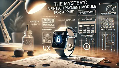
The Mystery
A Fintech Payment Module for Apple Watch
In 2021, I took on an intense 2-day workshop at Designboat UI/UX School, where the mission was clear yet challenging: design a seamless payment module for a Fintech app on the Apple Watch. With its tiny screen and unique interaction patterns, the platform demanded creativity and precision.
Time constraints meant the full UX process wasn’t possible, but that didn’t stop me. I pushed boundaries to craft a solution that balanced functionality and aesthetics within the ticking clock. Curious how it all came together? Let’s unravel the story!
The Cues
A Fintech Payment Module for Apple Watch kickstart the project, I conducted minimal but essential research to uncover key insights
-
Small Screen Constraints: Designing for Apple Watch required rethinking traditional UX patterns to fit within its compact display while maintaining usability.
-
Quick Interactions: Payments on a smartwatch must be seamless and quick, with minimal user effort.
-
User Expectations: Users expect familiarity and efficiency in financial apps, even on unconventional platforms like smartwatches.

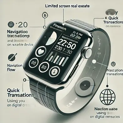
The Suspects
The primary challenges I identified included:
-
Screen Real Estate: Limited space for displaying information and controls.
-
Navigation Flow: Ensuring users can complete tasks quickly without confusion.
-
Usability on Wearable Devices: Adapting interactions to the unique capabilities of Apple Watch (e.g., Digital Crown, touch, and gestures).
The Investigation
UX Process:

Minimal Research
-
Researched payment modules and Apple’s guidelines to identify patterns and ensure best practices.

Low-Fidelity Wireframes
-
Sketched basic layouts to visualize the flow and placement of UI components.

User Flow
-
Created a streamlined user flow to map out the payment process, ensuring minimal steps for users to complete transactions.

Visual Design
-
Designed a clean, minimalistic interface with bold typography and intuitive icons, adhering to Apple’s design principles.

Information Architecture
-
Organized content hierarchically to prioritize essential elements like amount input, confirmation, and payment success.

Prototype
-
Created a clickable prototype to simulate the payment flow and test the overall design concept.
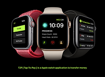
The Breakthrough
The Final Design
The final solution was a seamless payment module that balanced usability and aesthetics. Key features included:
-
Simplified Navigation: One-touch options and intuitive gestures for smooth transitions.
-
Clear Visual Hierarchy: Clear Visual Hierarchy: Essential actions like “Pay” and “Cancel” were prominent, ensuring quick decision-making.
-
Optimized Screen Usage: Critical information was displayed concisely, eliminating unnecessary clutter.


The Evidence
Deliverables
-
Delivered key artifacts including a User Flow Diagram and Information Architecture Map to define the app's structure and flow.
-
Created Visual Design Mockups to showcase the app's aesthetic and usability.
-
Developed an Interactive Prototype to simulate the user experience and test the design concept.
-
These deliverables ensured a clear, cohesive design aligned with the workshop objectives.


The Breakthrough
The Final Design
-
Simplified Navigation: One-touch options and intuitive gestures for smooth transitions.
-
Clear Visual Hierarchy: Essential actions like “Pay” and “Cancel” were prominent, ensuring quick decision-making.
-
Optimized Screen Usage: Critical information was displayed concisely, eliminating unnecessary clutter


The Missed Clues
Limitations Due to Time Constraints
While the final prototype was functional and visually appealing, the following aspects of the UX process were not fully implemented due to time limitations:
-
Primary Research: Lacked in-depth user interviews and surveys.
-
Testing: The prototype was not tested with actual users to validate its usability.
-
Iteration: There was no opportunity to refine the design based on feedback.
The Conclusion
Lessons Learned
This workshop emphasized the importance of adaptability and prioritization in a time-constrained environment. I learned to:
-
Think on My Feet: Quickly identify and address key design challenges.
-
Balance Functionality and Aesthetics: Deliver a visually appealing design without compromising usability.
-
Optimize for Constraints: Leverage creative problem-solving to work within the limits of small screens and tight deadlines.

Looking for a UX Designer?
JP Nagar , Bangalore
Thank you for taking the time to review my portfolio.
I appreciate your interest in my work. If you found the project valuable, I’d love to hear your thoughts. Feel free to reach out through the form below for any feedback or to explore potential opportunities. Looking forward to connecting!
Thank you
Thank you for taking the time to explore my work! Curious to see more? Feel free to explore the options below and discover how my skills and experience align with your needs. Whether you're looking for creativity, problem-solving, or user-focused design, there's plenty here to dive into. Don’t forget to check out my other projects for a broader perspective. Let’s connect and take the next step!